The notion of connecting physical controllers to your iPhone isn’t new – we’ve had Bluetooth-based options for many years, most of which bolt onto your device and have to be removed when not in use.
However, the arrival of emulation on Apple’s handset – ushered in by the company’s freshly-relaxed polices – has resulted in a spike of interest in the idea of using proper buttons over a finicky, imprecise touchscreen.
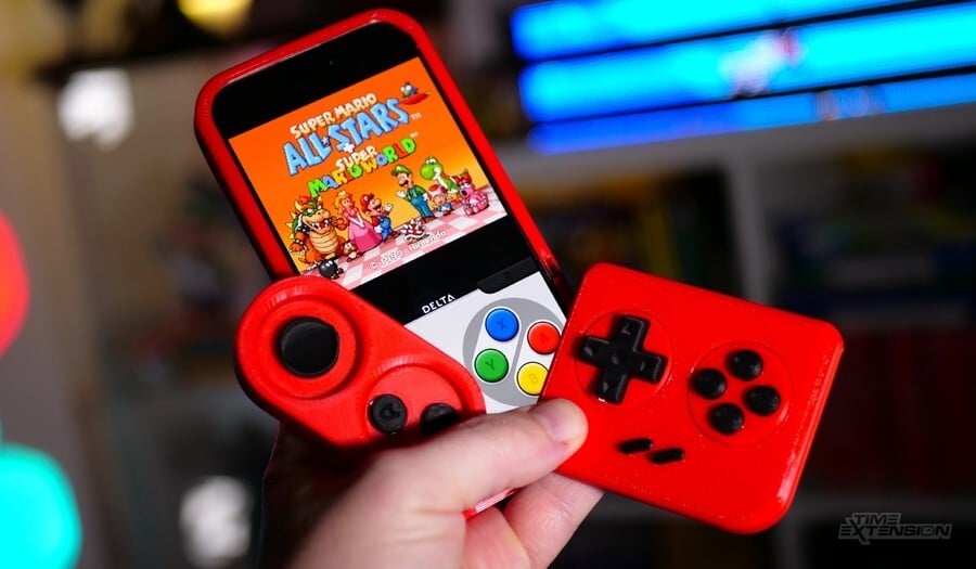
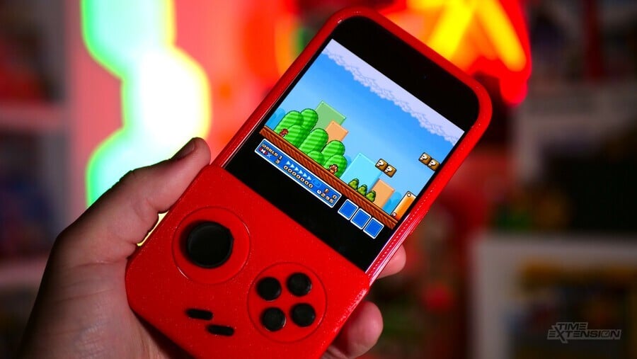
Into this landscape, Shelby Klein has released the PlayCase – a 3D-printed iPhone case that doubles as a physical controller and boasts modular expandability. It’s currently available for the iPhone 12 Pro, 13, 13 Pro, 13 Pro Max, 14, 14 Pro, 14 Plus, 14 Pro Max, 15, 15 Pro and 15 Pro Max, and costs around $50.
Klein was kind enough to send us a sample of the PlayCase, and we’ve been putting it through its paces over the past few weeks. In case you haven’t been up to speed with our coverage so far, PlayCase is a case (well, duh) that protects your phone but also has a detachable faceplate, which can be bolted onto the front of the case to offer physical inputs for gaming (when not in use, it docks on the back of the case).
The lack of tactile feedback is one of the key complaints people have when usual “virtual” buttons on a touchscreen, and the PlayCase solves this by introducing moving parts which, when they touch the display, bridge the electrically-charged element the capacitive screen needs to register input (your finger, basically) using conductive materials.
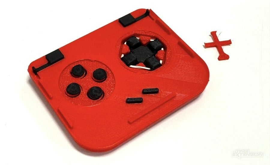
We were a little sceptical about this prior to trying out the PlayCase, but the system does work – and it works pretty well. Klein has designed 3D-printed components which flex and move, allowing the buttons to be pressed and then spring back into position, just like rubber membrane-backed buttons in a real controller. For the D-pad, he has employed a rubber band to force the pad to return to its “neutral” position – a somewhat crude solution, but one that works well regardless.
Does it feel as good as the real deal? Not quite. Because there’s no rubber membrane involved here – and the moving parts are stiff plastic – you don’t get the same “feel” as you would on a traditional pad. Having said that, it’s still much better than using a touchscreen.
The shoulder triggers are perhaps the most ingenious part of the setup; they’re located on the rear of the case and, when pressed, touch conductive sections on the faceplate, transferring your “trigger press” to the relevant part of the phone’s touchscreen. Again, all of this is done by linking your “touch” to the screen via conductive components, and it’s pretty cool.
PlayCase’s modular nature means that you can switch out parts to get the right experience. For example, if you’re playing NES games in Delta, you can switch out the button section for a part which only has A and B. SNES games, however, will use another part which has four buttons. The parts are designed to match the layout skin of the virtual buttons in emulators, and you can download more skins from the official site.
Even the D-pad can be swapped out for an analogue-style slider if you so wish; the parts you’re not using can be stowed away in a carrying case which attaches to your keys. Klein intends to expand the range of controls in the future as emulators like Delta (and the upcoming Ignited) offer a wider range of systems.

As a case, this product functions pretty well. The main part is made from flexible 3D-printed material which provides adequate protection from bumps and knocks. We perhaps would trust it to prevent damage from a big drop, but it’s certainly more robust than some of the ultra-thin TPU cases we’ve seen on the market.
There’s clearly been a lot of thought put into PlayCase, and you can’t argue that it doesn’t do exactly what it’s designed to – but there are elements of the product which need more refinement.
The most obvious issue I found was the fact that the 3D-printed nature of the PlayCase really counts against it. On the sample I was sent, the plastic which holds the D-pad snapped when I was pushing it into the face plate. It may be that I was being heavy-handed, but the plastic is very thin and brittle, so I can’t imagine it was destined to stand up to much punishment. Naturally, because it’s modular, I could just order a replacement, but that’s not the point.

Another big issue is that the L and R buttons protrude from the back of the case quite dramatically and can make it difficult to remove from your pocket if you’re wearing a particularly tight pair of trousers. This issue is exacerbated when you bolt the front plate onto the back of the PlayCase – which also means you can’t use your phone’s rear cameras.
Complaints with the 3D print are cosmetic, too. The overall appearance is rough, with print lines all over the case and the components. Given that Klein isn’t leveraging the mass-production muscle of a huge corporation to make PlayCase, it’s understandable that he’s had to take the 3D printing route, but that doesn’t totally excuse complaints about how this thing looks. After all, you’re putting PlayCase on a device worth over $1000, so it should at least look half-decent when it’s not being used. You’re not going to get many admiring comments about it when you’re out in public, put it that way.
I feel really bad about giving the PlayCase such a lukewarm reception because it actually achieves what it sets out to do relatively well – there are just a few rough edges which prevent me from recommending this as wholeheartedly as I’d like. Perhaps its creator can iron out some of these problems with a successor.
Thanks to Shelby Klein for sending us PlayCase to review.
Go on.... treat yourself to a new game.


1 Comment
The PlayCase sounds like a cool idea for turning your iPhone into a portable gaming console, but I get the mixed feelings from the review. It’s awesome that it offers physical controls instead of just relying on a touchscreen, which can be super frustrating for gaming. The modular aspect is a nice touch too—being able to swap out buttons for different games is pretty innovative.
However, the issues with the build quality are definitely a concern. If the plastic is snapping just from regular use, that’s a major red flag. And yeah, having those L and R buttons sticking out could be a real pain when trying to slide your phone into your pocket. It’s a shame that it looks a bit rough around the edges too; you want your gear to look good, especially when you’re rocking a pricey iPhone.
Overall, it seems like there’s potential here, but it sounds like it needs some refining to really shine. Hopefully, the creator can take this feedback and make the next version even better!